Drawing Graphs by Point-Plotting
Motivation
As mentioned in a previous lesson, we saw that it is possible to represent functions in different ways, such as graphs and algebraic rules. We hinted that we can represent the same function in several different ways. For instance, it is possible to represent the algebraic function \(f(x)=x^2-4\) not only as a rule, but as the graph below.

A natural question is “how can we go from \(f(x)=x^2-4\) to a graph?” While it is IMPOSSIBLE for humans or machines to draw graphs from a function’s rule exactly, we can certainly draw approximations via point-plotting and interpolation (i.e. connecting dots).
Review of Point-Plotting
For now, lets look at functions represented by tables and see how we can graph those.
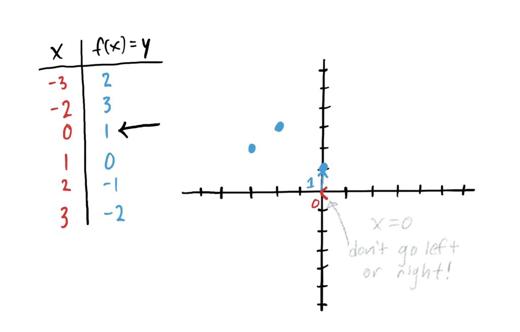
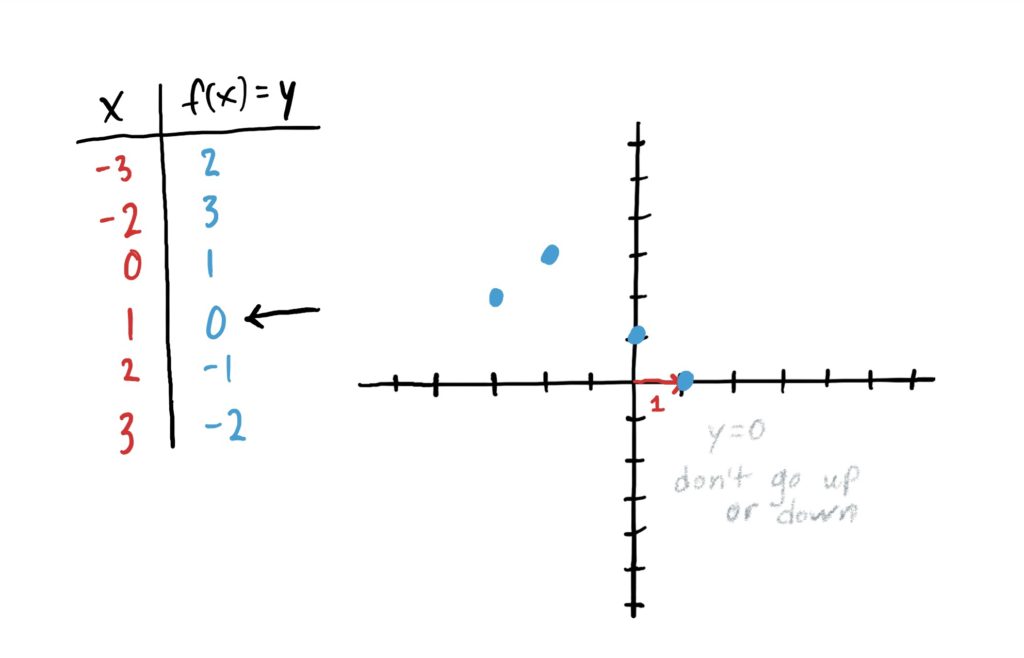
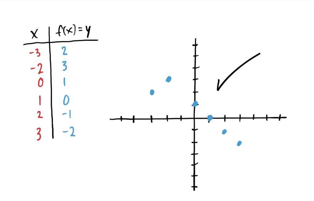
Let \(f\) be the function defined by the table below.

Note that the first column is the set of all inputs for which the function is defined. The second column is the set of all outputs associated with each input. Now, thinking about \(xy\)-graphs, \(x\)-values are the inputs, and \(y\)-values are the outputs. So, what we can do is let our inputs column in our table be \(x\)-values and the outputs column be \(y\)-values.
Then, to plot points on the \(xy\)-graph, read down the rows, and let the \(x\)-value inputs tell you how far to the left or right you need to go, and the \(y\)-value function outputs tell you how far you go. Once you’ve moved “over” according to your \(x\)-value, and “up/down” according to the \(y\)-value, draw a point. This is illustrated in the images below.


Important Note!
Notice that in the above image sequence we do NOT connect the dots at the end. This is because our function was defined by a table. Therefore, we only have outputs for the input \(x\)-values \(-3,-2,0,1,2\) and \(3\). We don’t have designated outputs for, say \(x=-1\), \(x=0.5\), or \(x=10\)… or anything else; nor do we have a way of finding them. The table gave us ALL the information about the function. We would connect the dots if the function was defined for all \(x\)-values between the points we just plotted.
Plotting Graphs of Functions Given By Rules
When we are given a function defined by an algebraic rule, such as \(f(x)=x^2-2x+4\) it is often helpful to represent it as a graph. We can use the same point-plotting method as we used above, but there’s a small catch: We don’t have a list of inputs or outputs! Therefore, we need to produce our own!
So, for example, suppose we are given the function \(f(x)=x^2-2x+4\) and we want to graphically represent it. What can do is start building our table by simply choosing a few different numbers as input \(x\)-values. See below.

Then, to generate the output \(y\)-values, we can basically do what you’d expect: plug our chosen \(x\)-values into the function to produce the corresponding \(y\)-values. This is shown below.

Now that we have a list of \(x\)-values and their corresponding \(y\)-values, we can plot points just like what we did in the last section. This is shown in the graph below.

Now here’s something important: The function \(f(x)=x^2-2x+4\) is defined at A LOT of other \(x\)-values, not just the ones we chose at random. We could have just as easily chosen fractions and decimal numbers as \(x\)-value inputs! (I chose whole numbers because it was convenient). Furthermore, no matter what number you plug in, you will get out a \(y\)-value. To represent this graphically, we interpolate all these different \(y\)-values between and beyond the points we plotted by drawing a smooth curve through them. This is shown below.

Note that the arrows at the ends of the graph indicate the assumption that the graph continues in those general directions.
Important Caveat!
When interpolating between plotted points with a smooth curve, we are assuming that the function’s \(y\)-values don’t fluctuate much for \(x\)-values between or beyond those of the points we plotted.; i.e. that the true graph of the function is fairly simple. It is entirely possible that the function may “wobble” wildly between or beyond the points we plotted. The graph we drew above could actually look like the one below!

The only way we’d know whether or not that happens is by plugging in sufficiently many \(x\)-values so that when we connect the dots, we get an approximation to the wobbly curve above. Note that even after plotting more points we still may not “catch” all the extra wobbles. To illustrate this, the green graph below is an approximation to the true gray graph that passes through a lot more plotted points.

In fact, when a computer or calculator graphs a function, it likely uses the same point-plotting method that we are using, but plots hundreds or thousands more points so that any weird wobbles are plainly visible. Note that even with thousands of points plotted, what a calculator gives you is still only an approximation of the actual function. It can still miss tiny wobbles that happen between the thousands of points plotted unless you “zoom in” on specific parts of the graph to have the calculator plot those in finer detail.
In Summary
To draw the graph of a function given by a rule, first generate a table of inputs and outputs: pick several \(x\)-values and plug them all into the rule to get output \(y\)-values. Then plot your points on a graph, connecting the points with a smooth curve, and make a mental note that the “real graph” might be a lot more complicated, and that you’d only see this if you plotted more points. However, usually, the “real graph” looks close to what we drew. (Typically only in upper-level math classes does one explore really nasty wobbly functions in detail)
In future lessons, we will look at different types of functions and how we might graph them based on properties we know the graph has instead of going through the laborious process of point-plotting.
| \(x\) | \(y=f(x)\) |
| \(-3\) | \(4\) |
| \(-2\) | \(2\) |
| \(-1\) | \(0\) |
| \(0\) | \(-3\) |
| \(1\) | \(2\) |
| \(2\) | \(1\) |
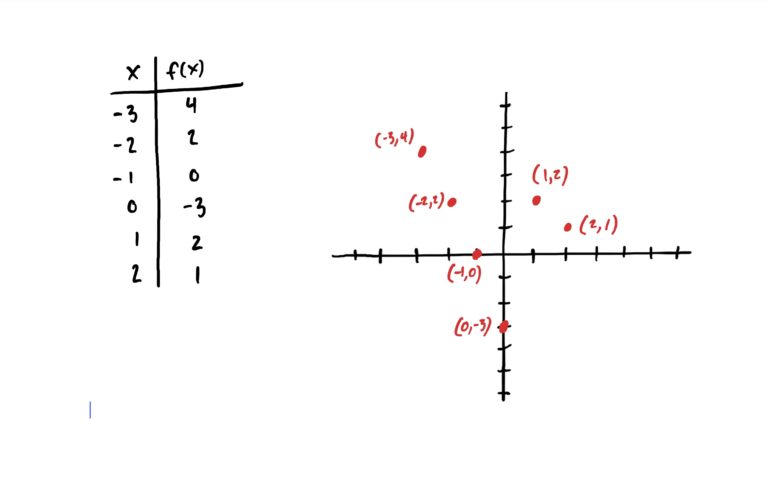
The \(x\)-value column tells you how far to move to the left or right along the \(x\)-axis. After moving left (if its negative) or right (if it’s positive) based on the given \(x\)-value, then use the corresponding \(y\)-value in the \(f(x)\) column to move up (if positive) or down (if negative).
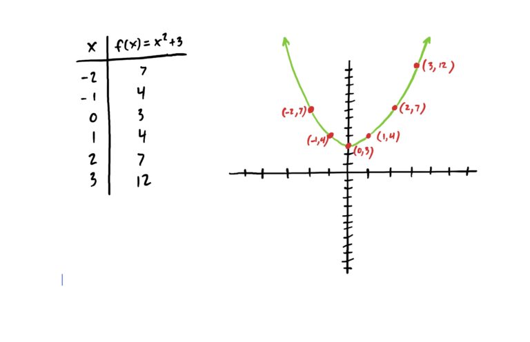
First, choose \(6\ x\)-values you wish to plug in. Put those in the first column of a table, then plug each of those into the function’s rule to get the corresponding \(y\)-value. Then plot your points on a Cartesian (i.e. \(xy\)) graph as explained below. Note that your points might be different from mine based on the \(x\)-values you choose, but your graph should vaguely resemble the one above nonetheless.
The \(x\)-value column tells you how far to move to the left or right along the \(x\)-axis. After moving left (if its negative) or right (if it’s positive) based on the given \(x\)-value, then use the corresponding \(y\)-value in the \(f(x)\) column to move up (if positive) or down (if negative).
| \(x\) | \(f(x)=x^3-x^2+1\) |
| \(-2\) | |
| \(-1\) | |
| \(0\) | |
| \(1.5\) | |
| \(2.25\) | |
| \(3.14\) |
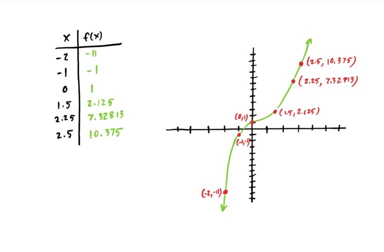
Plug each of those into the function’s rule to get the corresponding \(y\)-value. Then plot your points on a Cartesian (i.e. \(xy\)) graph as explained below.
The \(x\)-value column tells you how far to move to the left or right along the \(x\)-axis. After moving left (if its negative) or right (if it’s positive) based on the given \(x\)-value, then use the corresponding \(y\)-value in the \(f(x)\) column to move up (if positive) or down (if negative).